Choose your ad creative
It's now time for the creative portion of your ad creation process. As we move through the steps of the ads create tool, we find ourselves in the last step. And that's creating the ad.
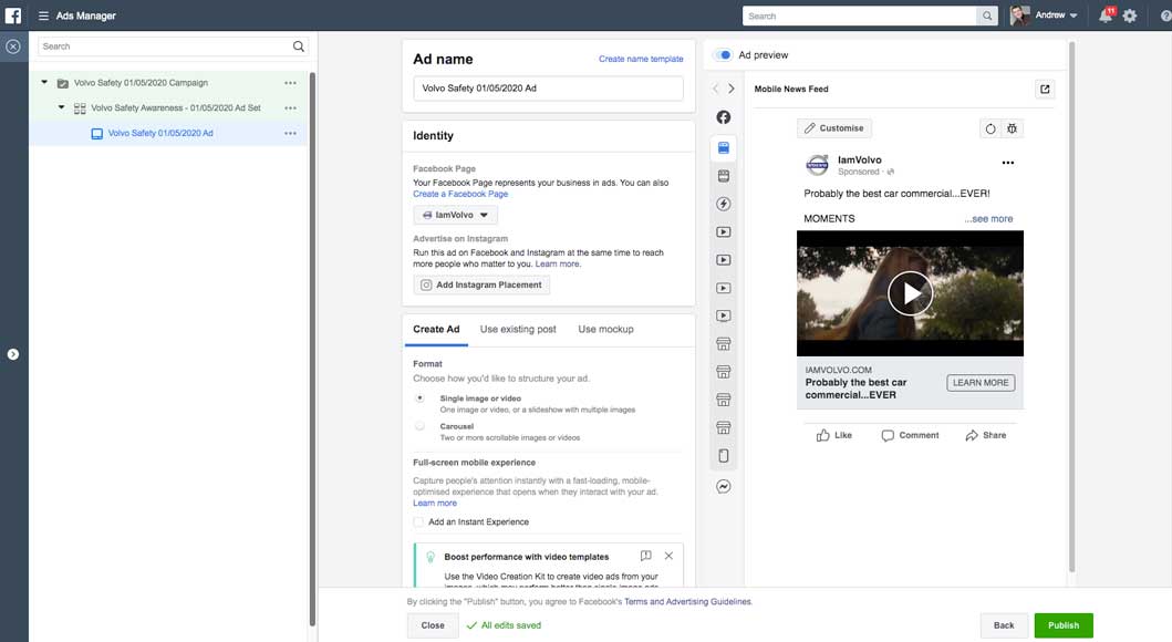
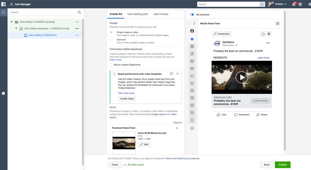
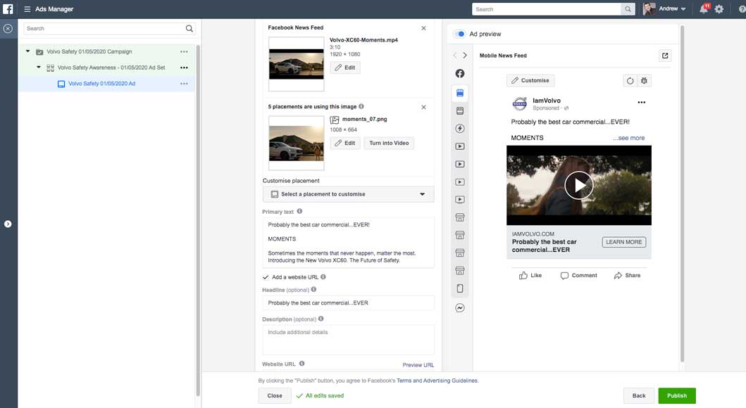
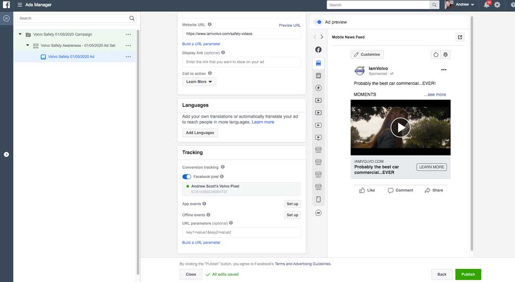
The type of creative you use will be based on the objective that you select. And in this example, we're looking at the brand awareness objective. But you'll be able to apply the same principles to any other objective as well. The first step is to create an ad name. And you'll find that at the very top. It's here you can be as descriptive as you want. So I'm going to call this the Volvo Safety Ad. Below that, I can choose to create an ad, or I can use an existing post. If I select that, Facebook will typically pull all the existing posts that I can choose from. But we're going to over creating a new ad, and I really recommend using this process. Below that is the identity. So if you have multiple pages under your advertising account, it's here that you're going to choose your applicable page. We have the H+ Sport connected. Below that, we can advertise in Instagram. So if H+ Sport had an Instagram account and I wanted to create an Instagram ad, I would go ahead and connect that. Now we are in the format section. I have two options. Currently, the single image or video is selected, and that's pretty self-explanatory. Or, we can do a carousel. So here you can have two or more scrollable images or videos. I'm going to stick with a single image or video for now. Underneath, we have an ability to add an instant experience. This is an advanced technique, but you can also choose learn more to see if this might work for your own advertising campaigns. Now we're in the media section. It's here we get to choose our images, our videos, or slideshow for our ad. Currently, we're in the image option. And if I wanted, I could also select video/slideshow to upload that instead. Now for each ad, I have an option to create up to six ads with unique images. That means that Facebook is going to go through and test out those different images, and then, eventually, they're going to find the image that works best for the audience and the criteria that I set up. Basically, they're going to show that image more often. So Facebook is really intuitive and really intelligent that way. Currently here, you can see that I have an image selected. If I scroll down, this is where I can see the image preview. 'Kay, so I'm going to scroll up, and I'm going to talk about how you can add an image. So here, I have two options. I can browse a library, or I can choose free stock images. If I have an image saved on my computer, I would simply add more images using this button here. Let's go ahead and search for browse the library. It's here I can see all the different images associated with my account. Next I have the stock option, and stock photography has come a long way. You can find some phenomenal images, and this is free. The watermark is not going to appear in the final ad. It's powered by Shutterstock, and it's a great option for newer advertisers, if you don't have that big photographer budget. So I'm going to go ahead and see if there's any images I think work. Here I can scroll down. If I like one, I can select it and hit continue. Facebook then is going to upload it, and here I have the ad two option. So I have ad one, showing the multiple marathon runners. And then I have the ad two, showing the female runner. This is going to be an interesting test to see if one of the images performs better. Now that I have those selected, I'm going to scroll down. Now keep in mind, depending on what I have selected, either ad one or ad two, that is going to show the preview here below. Next is the text section. So this is where I get to add in the copy, now that I have the image added. The text box is exactly like what you would create for a post on Facebook. So your posts can be a little bit longer, they can be more wordy, and they don't have to be super sales-y. You want them to be really organic natural. So here we're saying, "Fuel your race "and improve your pace with the new "and improved energy drink from H+ Sport." I can simply click into the box to edit and to change this text. Below that, I have the option to add a website URL. And I typically recommend this if you're looking to establish a brand, or especially if you're looking to drive traffic to your website. Here we have the website URL for H+ Sport. Below that, we can change the display link. So we can enter the link as we want people to see it in our ad. So I could say hplus.com, and it would show that way instead of the http://, which I think is a little bit clunky. Underneath that, we have our headline. So this is going to be limited to, I believe it's 60 or 90 characters, and you'll find out when you run out. And you want it to be short and punchy, and to the point. If you're a little bit unclear about what to create, again, you can hover over the information icon, and Facebook is going to let you know where this appears in your ad, if it appears at all. So for example, mobile news feed will not have this headline in the placement. And underneath that, we have our news feed link description. Now, these are all optional. So if I remove, say, the news feed link description, Facebook is going to automatically pull this information from the URL I provided. So I recommend double-checking the information it's pulling, and customizing it so it makes more sense and is more cohesive. Below that, we have our call to action button. Typically, advertisements with a call to action button perform better than ones that don't. So you're letting your audience know what action you want them to take. We have a whole bunch of different options. We can have them contact us. We could have them learn more, for example. And if I select that, it's underneath the image to the right, that you can see where that button shows up. And that button then is going to take them to the link that I provided. Underneath that, we have some conversion tracking. Because we're sending people to our website, Facebook wants us to add a snippet of code, which is called a Facebook Pixel. And that Facebook Pixel basically follows those people around on our website, and reports back to our analytics dashboard, showing who showed up on our website and where they went. Now, this isn't always necessary for all the ads that we're running, but it is highly recommended. So if I select Facebook Pixel, it's here that Facebook is going to then, if you don't have a Facebook Pixel set up, walk you through those steps of getting that set up. If you're just starting out, keep that unselected. You can still run a really effective ad campaign without it. I love the ad previews, and that's the column on the right. It's here with the dropdown I can see how it's going to show up in different places. For me, it's really really important to have the ad customized and have it show up properly in the specific locations you wish for it to show up. So, I don't want an image to be cut off, I don't want the text to be cut off. It looks sloppy. So I'm always going to make sure that it looks really great in the different placements I have set up. Go through your own business assets, or even the stock photography, to get a little bit of inspiration for how you can create some brilliant ad creative. Start pulling some compelling images for your ads, brainstorming different headlines, and if you're totally stuck, Google some competitors, and see what they're doing in the advertising space. Bright colors, high resolution, and creative choices will contribute greatly to the success of your advertising campaign.


Social Media Campaign
Facebook Advertising
Google Adwords-YouTube Video
click on title to view
Learn advertising terms and concepts
How advertising works on YouTube
Google Adwords Advertising
Marketing Content
click on title to view
My Music Selection
|
|
|||||